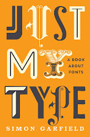
We looked at finishes that can be overlaid onto book covers to make the book stand out. Finishes like this require a much higher budget, and can be reserved for star authors or very promising titles. Extras include but are not limited to:
- Matte
- Super matte
- UV overlay
- Holographic overlay
- Foil overlay
- Embossing
- Adding stickers
- Cloth binding
I also noted down some important technical terms from the lesson:
Kerning- the letter spacing horizontally, this can be used for making sure the text fits nicely on the page or altering the font to make it more spaced-out or close-together.
Leading- is the space between the lines. Reducing the space between the lines can be useful if there is a lot of text to reduce page number, but increasing the space between the lines can increase readability. Larger spaces are generally more helpful for children.
Serif font- a font that has the little lines on the bottom.
Sans-serif font - a font that doesn't have the lines on the bottom.
Superscript- the little 'st' in 1st.
Baseline- the invisible line on which the text sits.
Widow- A widow is a short line/word that sits at the bottom of a paragraph. This makes the text look messy and leaves a larger blank white space below the paragraphs that hinders readability. Adjusting the kerning or leading can prevent this
Orphan- As above, but an orphan describes a single word or few words at the top of a page, above a paragraph.
A little note about punctuation for budding typesetters:
- Hyphen '-' for joining words like 'mother-in-law'
- En dash '–' for joining dates/time, to indicate the passing of time '18th–21st of March' 10–2pm'
- Em dash '—' to indicate a pause, 'everyone stopped talking—'
- Quotation marks - '' (obv for quotations) (around 'sloped' on the diagram below)
- Speech marks - (obv for speech) (around 'blocky' on the diagram below)


No comments:
Post a Comment