Monday 29 February 2016

Lionheart


In Thursdays session, Ness Wood of David Fickling Books (@wood_ness on twitter) came into the session to talk with the group about the book design process. It was a really exciting talk, and Ness' career has been overwhelming.  Ness also doubles as a book historian, and works with Queen Mary University

In the lesson, we were given the hardback cover to Richard Collingridge's Lionheart, which looks like this: 

We were then asked to formulate a different paperback cover, suitable for supermarkets with mass-market appeal. We were given the option of sketching or of using Photoshop and I thought I had better use the time to hone my skills. The illustrations from the book were available on Blackboard, and I had a look through to find a different image with both of the major characters that would be graphic enough to get noticed, and display the excellent illustrations: a major selling point.

pesky birds
I found this one, and I used the lasso tool to cut around the image - which wasn't very easy for a novice like me because of the hairiness of the lion and the trickiness of the birds. I thought the background could be more dynamic and tell more of the story, so I had a look through the illustrations and found the image below. The animals in the book are a main feature of the story, and displaying them more prominently on the cover was important. I like how in this image, the animals are peeking through the wilderness:


I then sought to put the lion over the more exciting background image, and I blurred and blurred and blurred to get rid of any pixel-y problems. I also cut out a few birds from the first image and positioned them so they were flying off the screen, which I thought looked quite hopeful and gave a nice uplifting tone to the image. Choosing an illustration where the lion looks quite sublime was an important factor in the process, because the book is about a child overcoming fear. Evoking that on the cover with the juxtaposition of a small child and a large lion was quite important. I also think that this nods to the original cover, where the two were contrasted in a similar way. 


For the final version, I manipulated the contrast, saturation and added a filter so the colours would be quite powerful for added visibility. I also used a similar font to the original cover on my version, but if I were to go back and change anything, I would probably make it bold so it would stand out more on supermarket shelves. The red star - which looks  quite gaudy on the image - symbolises a sticker of some sort. Possibly added by the publisher to show an award the book has been involved with (like being nominated for the V&A best illustrated book), or for the supermarket to place an offer or a price.

I'm really excited that my Photoshop skills are improving, and I'll let you know if I get any feedback on my version of the cover.

Thursday 18 February 2016

cover design layouts

Today I'm focussing on the really technical, IT-based book design aspects. I'm practising my use of Adobe InDesign and Photoshop and I've really been enjoying it. Here are some technical things I've learnt this week:

Standard Book Sizes: 
Picture Book - 240mm x 200mm

Paperback Fiction Book - 198mm x 129mm 

Hardback fiction - 216mm x 198

Terms
Some terminology commonly referred to during this aspect of production are:

  • Bleed - a 5mm allowance along the outside of the cover, where no detail is printed. This protects against the cover being cut short. 
  • Gutter - the mid-section of the cover, where the spine sits after printing.
  • Turnaround - An allowance that allows extra space on a cover jacket for the flap to fold over easily.
  • Board Allocation- on a hardback book, the card is sometimes 3mm thick. Designers allow for this during the design process, so the cover fits over the whole book.
  • Slug area- on Indesign or Photoshop, the area between the bleed and 5mm above, where the fold lines are placed to indicate where production should cut the card. 

Here is an example of a picture book cover, laid out on InDesign and the cover created in Photoshop: 


And here is my attempt at a hardback cover jacket, I also designed a basic cover design on Photoshop but ran out of time to place the cover onto the file:


I will be sure to update you on my progress!

Picks of the Month: designers and career goals

I'm stumbling onto some really great resources this week through recommendations and research, here are some interesting book-design-related finds of note from this week that I've taken inspiration from:


Ted Talk with Chip Kidd


Chip Kidd is a successful book designer and this TED talk was a really interesting look at book marketing, and also a pretty entertaining piece of media. Chip talks about the relationship between design and marketing in a fresh and accessible way, and his story is inspiring for a sapling publisher like myself. 'Not treating your audience like a moron' is something I'll definitely take on board through to my future cover designs, and I think it's pretty transferable to all visual industries. 


Interview with Suzanne Dean - art director at Random House

 
The ways in which publishers decide to re-animate their backlist really interests me. Art Director Suzanne Dean talks in detail in this interview about her re-designs for titles like Psycho and The Man with the Golden Gun. I particularly like the fact that the designs have a running aesthetic, and Suzanne states in the interview that it was important that the 'visuals cohere'. I think this adds a sense of ownership to the backlist on the publishers' behalf, and enhances marketability by building such a visually contemporary collection. 

The lesson today pushed me to utilise InDesign like never before, and I was able -through careful coaching by the brilliant Becky Chilcott - to design both picture and hardback book covers at the end of the lesson. 


Thursday 11 February 2016

imagery and me

Becky began by offering a few designers and illustrators of note to research and admire:

Peter Mendelsund - Italo Calvino
This interview discusses Peter Mendelsund's design process, and it's a really interesting insight. Some of his designs are below:


Alice Todd- The Art of Being Normal
Is a really interesting and graphic book cover. The use of colour is inspired, and I particularly like how the design continues through the book. The image really fittingly describes what the novel is about, and the cover in its entirety is very marketable and visually drawing. The endpapers are also notable for their simplicity and effectiveness.


Lisa Jones
Lisa Jones' illustration is really quite different to the content that I've previously researched, but the apparent simplicity of her design can go on to have a really impactful visual appeal. Her work is cute, colourful and graphic and fits the child-based target market really effectively with an added modern illustrative aesthetic for booksellers and parents.


The lesson covered a lot of terminology about the use of images in cover and book design, I've noted some important terms below:

Picture Rights

Rights Managed- buying exclusive rights to an image for an agreed time period

Royalty Free- anyone can download and use for free

Micro Stock- amateur photos, creative commons on websites like Flickr, Wikimedia.

Colour Printing

CYMK- Cyan, Yellow, Magenta and Black are the four colours that all standard colour printing is done with. Adjusting these levels can provide most colours that you would require, but not all very bright and neon colours.

RGB- Red, Green and Blue are the three colours that make up all digital images. Altering these on photoshop can give all of the different colours.

Pantones- Pantones are specialised colours that cannot be created effectively using CYMK printing. These colours can be ordered and overlaid on a book cover. Use of these colours usually adds cost.

Image Quality

72 dpi- (dots per inch) is usually fine for files that will only be viewed through a digital medium and not printed.

300 dpi- is a print quality design setting.

Some places that book designers tend to research illustrators are listed below:

  • Pintrest
  • Deviant Art
  • Twitter
  • Dictionaries
  • Illustrator Directories 

To end the lesson, I tried to enhance my Photoshop skills by trying to manipulate a using an illustration of children with varying degrees of effectiveness:


 I've been working on my final project to put all of these new skills into practice.

Thursday 4 February 2016

typography and me

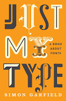
Typography is so interesting! I'm really enjoying every and anything design-based. Becky's lesson today covered everything from the conception and appropriateness of a font to the more technical terminology. Some important books on the subject that I'll have to note down here are:


We looked at finishes that can be overlaid onto book covers to make the book stand out. Finishes like this require a much higher budget, and can be reserved for star authors or very promising titles. Extras include but are not limited to:

  • Matte 
  • Super matte
  • UV overlay
  • Holographic overlay
  • Foil overlay 
  • Embossing 
  • Adding stickers
  • Cloth binding

I also noted down some important technical terms from the lesson:

Kerning- the letter spacing horizontally, this can be used for making sure the text fits nicely on the page or altering the font to make it more spaced-out or close-together.

Leading- is the space between the lines. Reducing the space between the lines can be useful if there is a lot of text to reduce page number, but increasing the space between the lines can increase readability. Larger spaces are generally more helpful for children.

Serif font- a font that has the little lines on the bottom.

Sans-serif font - a font that doesn't have the lines on the bottom.

Superscript- the little 'st' in 1st.

Baseline- the invisible line on which the text sits.

Widow- A widow is a short line/word that sits at the bottom of a paragraph. This makes the text look messy and leaves a larger blank white space below the paragraphs that hinders readability. Adjusting the kerning or leading can prevent this

Orphan- As above, but an orphan describes a single word or few words at the top of a page, above a paragraph.

Ligature- is the joining of two letters together during font design.


A little note about punctuation for budding typesetters: 

  • Hyphen '-' for joining words like 'mother-in-law' 
  • En dash '–' for joining dates/time, to indicate the passing of time '18th–21st of March' 102pm'
  • Em dash '—' to indicate a pause, 'everyone stopped talking—'
  • Quotation marks - '' (obv for quotations) (around 'sloped' on the diagram below)
  • Speech marks - (obv for speech) (around 'blocky' on the diagram below)